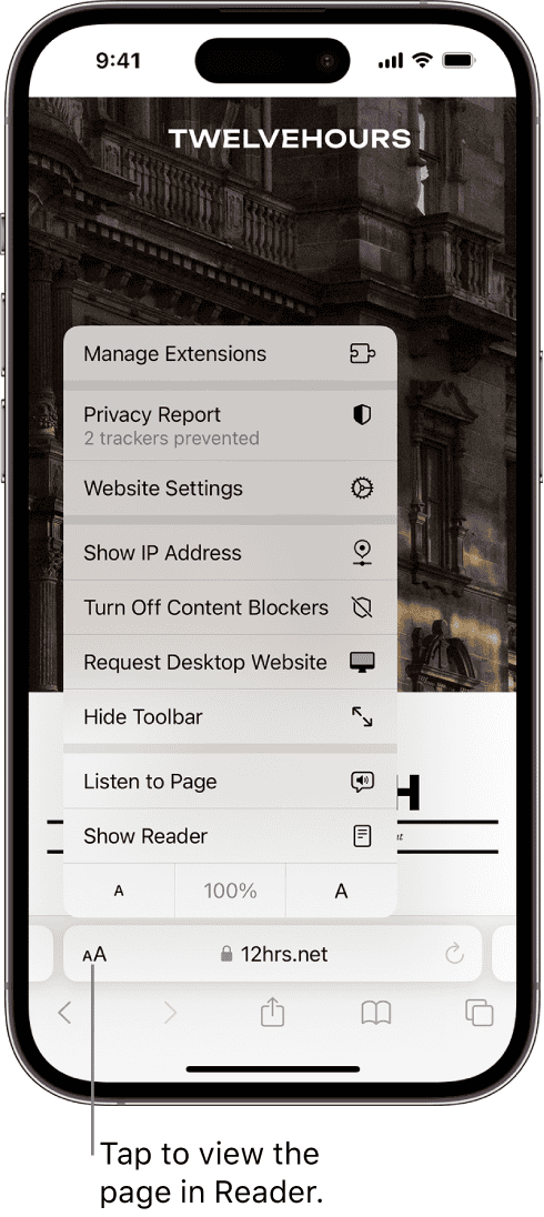
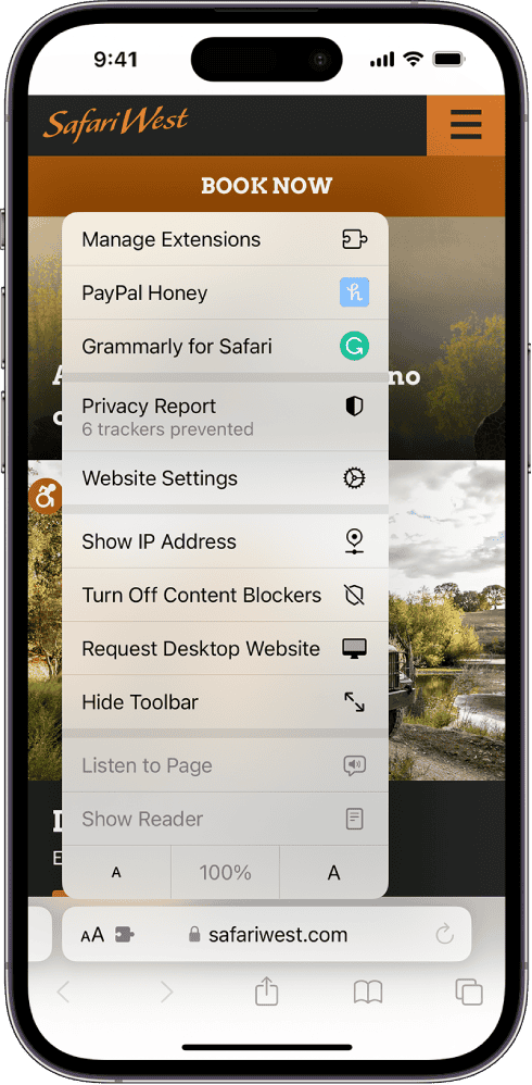
When using Safari on an iPhone, you can enter full screen mode to focus on the content without any distractions. This maximizes your viewing area and is great for reading articles, watching videos, and viewing web pages without any toolbars or search fields cluttering the screen. You can easily activate this mode with simple gestures or taps, depending on how you’re holding the device. iOS updates continue to improve this functionality to make browsing the web effortless and give you more screen space.
Maximizing Your View: Using Safari’s Full Screen Mode on iPhone
Want to see more of your favorite websites on your iPhone’s screen? Safari’s full-screen mode is a simple way to hide distractions like the address bar and toolbars, maximizing your viewing area. Here’s how to activate it and navigate while in full-screen mode.

Activating Full Screen
- Portrait Mode: Simply tap the “aA” button at the top left (or bottom left depending on where your address bar is) corner of your screen. A menu will appear, and you’ll see the “Hide Toolbar” option. Tap it, and the toolbar will disappear, giving you a full-screen view.
- Landscape Mode: In landscape mode, the full-screen button is even easier to find. It’s a pair of arrows located at the bottom right corner of the screen. Tap it to switch between full screen and standard view.
Navigating in Full Screen
- Revealing the Toolbar: Swipe up from the bottom edge of the screen to bring back the address bar and toolbars.
- Scrolling and Zooming: You can still scroll and zoom as you normally would, even in full-screen mode.
Additional Tips
| Feature | How to Access |
|---|---|
| Reader View | Tap the “aA” button and select the icon that looks like a series of lines. This strips away clutter and focuses on the main text content. |
| Bookmarks | Swipe up to reveal the toolbar, then tap the bookmarks icon. |
| Tabs | Swipe up to reveal the toolbar, then tap the tabs icon. |
By mastering these simple gestures, you can enjoy a more immersive browsing experience with Safari on your iPhone. Just remember, the full-screen view is great for reading articles or viewing photos, but you’ll need to bring back the toolbar to navigate to other pages or access additional features.
Key Takeaways
- Safari on iPhone offers a full screen mode to enhance content viewing.
- Activating full screen mode is straightforward and user-friendly.
- Full screen browsing supports Apple’s dedication to streamlined user experiences.
Enabling Full Screen Mode on Safari for iPhone
Maximize screen real estate by learning how to enable full-screen mode on Safari for your iPhone. The process is simple and enhances your browsing experience.
Using Safari’s Full-Screen Feature
To enter full-screen mode on Safari, an iPhone user just needs to rotate their device to landscape. Look for the full-screen icon, which appears as two diagonal arrows. Tap this icon to expand Safari to full screen.
Advantages of Browsing in Full Screen
Browsing in full screen offers a clean view by hiding the search and navigation bars. This maximizes screen space, which can make reading and viewing images more pleasant.
Navigating Web Pages in Full Screen Mode
While in full screen, Safari detects gestures to help you navigate. A tap at the bottom of the screen reveals the toolbar again, allowing you to input a new address or use other browser features.
Optimizing Web Content for Full Screen Display
When building a website for mobile users, optimizing it for full-screen display on iPhones is crucial. It ensures the content takes full advantage of the available screen space, enhancing the browsing experience.
Creating Full-Screen-Enabled Web Pages
Developers can create web pages that are capable of displaying content in full-screen on iOS devices. This involves adding the apple-mobile-web-app-capable meta tag to the head of your HTML document:
<meta name="apple-mobile-web-app-capable" content="yes">
When this tag is in place and the user adds a website to the home screen, safari launches the site in full-screen mode. This mode hides safari user interface components like the address bar and the book mark button.
Improving User Experience on Smaller Screens
Optimizing web pages for smaller screens means removing unnecessary distractions. Content should be legible and easy to navigate. Users often prefer web pages that look and feel more like native apps, especially on mobile devices. For images, it’s important that they scale correctly to avoid pixelation or awkward layouts, ensuring an enjoyable full-screen experience.

Meta Tags and Apple-Specific Features
To further improve web content for full-screen display, use specific meta tags meant for Apple devices. These tags control the status bar’s appearance, decide whether the page runs in full-screen mode, and more. An important one to include is:
<meta name="apple-mobile-web-app-status-bar-style" content="black-translucent">
This tag allows the web content to display under the status bar, creating a seamless edge-to-edge experience on the iPhone.


